Although I have never really believed in the old cliché a picture is worth a thousand words, I have been a big fan of effective illustrations for many years.
 I started with the seminal works The Visual Display of Quantitative Information and Envisioning Information by statistician and sculptor, Edward Tufte. Although, I have to say I was always somewhat underwhelmed by his examples.
Thanks to a recent BBC series on The Beauty of Diagrams, I discovered that Florence Nightingale (who is best known as the nurse who cared for thousands of soldiers during the Crimean War), was the first to use statistical graphics as to illustrate the causes of mortality.
More recently I have discovered the Cool Infographics blog, and have seen some excellent examples of effective presentations of statistical information.
The Conversation Prism 3.0 for 2010 shows the major players in each of 28 different online conversation categories.
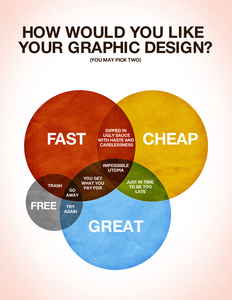
Although not strictly speaking statistics related, How Would You Like Your Graphic Design? gets an important point across very effectively.


